True Autumn Color Palette
Warm · balanced value · rich and muted · also called Warm Autumn
Warmth is the defining quality, with a rich, earthy finish. Golden and spiced colours read as yours.
 Example
Choose your own photo
Find your color season and palette.
Choose your own photoClick to choose a photo, or drop one here
Front-facing · Even lightingStraight-on, even lighting, at arm's length gives the most comparable reading.
Runs in your browser. Your photo is not uploaded.
The True Autumn color palette
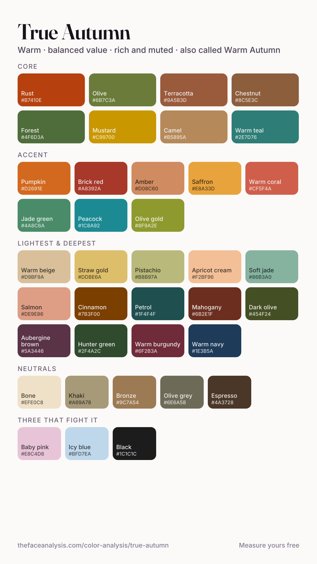
30 colours in four groups and 5 neutrals, each written out with its hex code — tap any code to copy it, or take a whole group at once. The same palette is available as a True Autumn palette card (PNG) sized for a phone screen, to take shopping.
Core
- Rust
- Olive
- Terracotta
- Chestnut
- Forest
- Mustard
- Camel
- Warm teal
Accent
- Pumpkin
- Brick red
- Amber
- Saffron
- Warm coral
- Jade green
- Peacock
- Olive gold
Lightest
- Warm beige
- Straw gold
- Pistachio
- Apricot cream
- Soft jade
- Salmon
Deepest
- Cinnamon
- Petrol
- Mahogany
- Dark olive
- Aubergine brown
- Hunter green
- Warm burgundy
- Warm navy
True Autumn core and accent colors
The eight core colours are autumn at full strength: rust, mustard, terracotta, chestnut, camel, olive, forest and a warm teal. Every one is golden-based, earthy and medium in depth, with enough saturation to look rich rather than dusty. That is the season — warmth is the strongest thing about the colouring, so colours that are clearly warm read as belonging, and colours that are clearly cool read as borrowed.
Accents are the spiced end of the palette: pumpkin, brick red, amber, saffron, warm coral, olive gold, and for colour that is not orange, jade green and peacock. A True Autumn does not need to soften its accents the way a Soft Autumn does, and does not need to darken them the way a Deep Autumn does. Pinks work when they lean toward coral and salmon; blues work when they lean toward teal.
The lightest and deepest True Autumn shades
The lightest True Autumn shades — apricot cream, warm beige, straw gold, pistachio, salmon, soft jade — are for shirts, summer knitwear and linen. They are warm and slightly earthy rather than pastel. The deepest — cinnamon, mahogany, warm burgundy, aubergine brown, hunter green, dark olive, petrol and a warm navy — are the colours to use when an outfit wants something dark. Warm navy is the answer to the navy question: a navy with some green in it, closer to petrol than to ink, works on this season; a cold, blue-black navy does not.
True Autumn neutrals
- Bone
- Khaki
- Bronze
- Olive grey
- Espresso
Five neutrals carry the wardrobe. Bone replaces optic white; espresso replaces black; khaki, bronze and olive grey fill the middle. Camel sits in the core colours but does the job of a neutral too — a camel coat is the most reliable single piece a True Autumn can own.
What makes a True Autumn: warm or cool, light or deep, soft or bright
True Autumn is warmth at full richness — the season most people picture when they hear the word. Skin has a golden or olive cast, hair runs warm brown to auburn with real depth, and the eyes are often warm hazel, amber or deep green. Spiced, earthy colours read as belonging; anything icy or pastel reads as borrowed.
True Autumn and Warm Autumn are the same season. One family of the twelve-season system names the middle subtype of each season True; the other names it by its defining quality, which for this one is warmth. This page answers to both.
The test on this page turns three measurements into numbers between minus one and plus one. Warm–cool is mainly the hue angle of your skin in CIE Lab, with your hair counting for about a third. Light–deep is skin and hair lightness together, with hair weighted slightly more. Soft–bright is the saturation of your irises and the lightness gap between hair and skin, half each.
It calls you True Autumn when warm–cool reads warm and neither of the other two axes gets past 0.3, with light–deep below zero. In plain terms: warmth is the only strong signal, and the colouring sits slightly on the deep side of the middle. That is what people mean by medium autumn — not a separate season, just the centre of the warm family where depth and clarity are both unremarkable.
The rule shows exactly where the neighbours are. If light–deep is at zero or above, the same reading is True Spring — the two seasons are separated by nothing but the sign of depth. If depth gets past 0.3 it becomes Deep Autumn; if softness does, Soft Autumn; and if clarity does, Bright Spring. The three bars on your result tell you which way you lean.
True Autumn skin, eyes and hair
Skin — examples across depths
Eyes
Natural hair
These are examples, not a checklist, and blue eyes are on the list on purpose. Eye colour does not decide warm or cool on this test at all — it only feeds the soft–bright axis — so a True Autumn can have blue or grey eyes as long as skin and hair read warm. The season runs from fair to deep skin; what makes it is a golden or olive cast with hair and eyes at a medium depth and a medium clarity.
Am I a True Autumn? A drape test you can do at home
Warmth is obvious here, so the useful tests are about depth and saturation.
- 1
Stand facing a window in daylight, with no coloured walls behind you and no makeup. Tie your hair back or cover it with a white towel so it does not vote.
- 2
Test temperature first — for a True Autumn it is the whole story. Hold an icy blue under your chin, then a warm teal. On a True Autumn the icy blue makes the skin look grey and the teal brings warmth back into the face.
- 3
Then white: optic white against cream or bone. Bone should win decisively. If optic white wins, you are in the cool family.
- 4
Finally check that nothing else is stronger than the warmth. Rust at full strength should look like your colour rather than a costume (if it overwhelms you, look at Soft Autumn). Pastels should look weak rather than pretty (if they suit you, look at True Spring or Light Spring). And near-black brown should look slightly heavy (if it looks best, look at Deep Autumn).
The temperature test: a blue that is cool and pale against one that is warm and rich. An illustration of a drape test — it shows the two colours, not a result on a real face.
The white test: the quickest single check of the warm family. An illustration of a drape test — it shows the two colours, not a result on a real face.
- Rust and mustard at full strength should look like your colours, not like a costume.
- Cream should beat optic white under the chin, decisively.
- Pastels should look weak on you rather than pretty — that is the signal you are not in the light half of the warm family.
True Autumn vs Soft Autumn, Deep Autumn and True Spring
| True Autumn | Soft Autumn | Deep Autumn | True Spring | |
|---|---|---|---|---|
| Warm or cool | Warm | Warm | Warm | Warm |
| What decides it on this test | Warmth alone | Softness | Depth | Warmth alone |
| Depth | Medium, slightly deep | Medium | Deep | Medium, slightly light |
| Clarity | Rich | Very muted | Rich | Clear |
| One-colour test | Rust at full strength looks right | Rust looks loud; soft brick wins | Walnut beats caramel | Clear coral beats rust |
| Darkest neutral | Espresso | Bark | Dark chocolate | Coffee |
| Metal | Yellow gold, copper, bronze | Brushed or antiqued gold | Antiqued gold, bronze | Bright yellow gold |
True Autumn
Soft Autumn
Deep Autumn
True Spring
True Autumn vs Soft Autumn is the most searched comparison for this season, and it comes down to how much saturation you can carry. Both are warm and both are medium in depth. Soft Autumn is called when muting is the strongest signal — hair close to the skin in lightness, eyes without much saturation — and rust, mustard and pumpkin look like the loudest thing in the room on it. On a True Autumn those same colours look natural and the greyed versions look slightly faded. Hold rust against soft brick under your chin: rust wins on a True Autumn, soft brick on a Soft Autumn.
True Autumn vs Deep Autumn is a question of depth. Deep Autumn is called when depth is the strongest axis, which usually means dark hair; it carries near-black browns, oxblood and pine, and mid-range colours like amber can look slightly weak on it. On a True Autumn the darkest browns look heavy and the middle of the palette is where the face looks best. Walnut against caramel is the quick test — caramel wins on a True Autumn, walnut on a Deep Autumn.
True Autumn vs True Spring is the comparison most sites leave out, and on this test it is the closest border of all. Both are called when warmth is the only strong signal; the sign of light–deep splits them, so a result a few hundredths either side of zero can flip between the two. In a drape the difference is clarity and weight: True Spring wants clear, lighter warm colours — coral, golden yellow, leaf green — and True Autumn wants richer, earthier ones. If clear coral beats rust, read the True Spring color palette.
True Autumn colors to avoid, and what to wear instead
The three colours that fight a True Autumn hardest are below. Three, not thirty — a palette is a prediction about which tones lift the face, not a list of banned colours, so every one of them has a version that does the same job.
- Baby pink
- Icy blue
- Black
| Instead of | Wear | Why |
|---|---|---|
| Black | Espresso | A warm near-black keeps the depth without the hard, cold edge next to golden skin. |
| Optic white | Bone | The white of the palette; optic white glares and makes warm skin look sallow. |
| Baby pink | Warm coral | Pink moves toward coral and gains the weight the face needs. |
| Icy blue | Warm teal | Blue survives as a warm, rich teal. |
| Fuchsia | Brick red | The same intensity on the warm side of the colour wheel. |
| Cool grey | Khaki | A grey with a brown-green cast does the same job without reading flat. |
| Lavender | Aubergine brown | Purple works warmed toward brown and carried at depth. |
True Autumn outfits and clothing
Six combinations built only from the palette, shown in the proportions you would wear them — the largest block is the main garment, the smallest is the accessory.
Camel and rust
A camel coat, a rust knit, a bone scarf. The True Autumn signature.
Olive and mustard
Olive trousers or a jacket, a mustard top, espresso boots.
Teal and chestnut
A warm teal dress, a chestnut leather jacket, warm beige accessories.
Forest workday
Hunter green suiting, a bone shirt, one pumpkin accent.
Brick and khaki
A brick red sweater, khaki chinos, bronze jewellery or belt.
Burgundy evening
A warm burgundy dress, an espresso wrap, saffron-gold jewellery.
| Occasion | What to wear | Neutral that carries it |
|---|---|---|
| Work | Camel, chestnut or olive grey suiting with a bone or apricot cream shirt | Olive grey |
| Corporate | Espresso or warm navy suit, bone shirt, rust or olive gold tie or scarf | Espresso |
| Weekend | A mustard, rust or forest knit, mid-wash denim, tan or chestnut boots | Khaki |
| Evening | Warm burgundy, mahogany or peacock in velvet or silk | Espresso |
| Wedding guest | Jade green, saffron, warm coral or peacock in a fluid fabric | Bone |
| Interview | Espresso or chestnut with bone and one brick red accent | Bronze |
True Autumn suits medium-contrast, warm prints: paisley, tweed, herringbone, houndstooth in brown and camel, tartan in rust and forest, botanical and leaf prints, animal prints in warm browns. Neon, icy or black-and-white graphic prints fight it. Texture is part of the palette — suede, corduroy, tweed, leather, chunky knits and linen make warm colour look richer than slick synthetics do.
True Autumn capsule wardrobe
- Camel wool coat
- Olive trousers
- Bone shirt
- Rust crew-neck knit
- Chestnut leather jacket
- Espresso blazer
- Mustard sweater
- Mid-wash denim
- Warm teal dress or shirt
- Tan suede boots
- Yellow gold or bronze jewellery
- Cognac leather bag
True Autumn color palette for men
The palette is close to classic country menswear. Suits in camel, olive, chestnut tweed or espresso replace black and cold navy — a brown or olive tweed suit looks deliberate on a True Autumn. Shirts in bone, warm beige and apricot cream rather than stark white. Knitwear in rust, mustard, forest and camel. Ties and pocket squares carry rust, olive gold, brick red and warm teal; leather goods in cognac and chestnut rather than black. If a navy suit is needed, choose one with some green or grey in it and pair it with bone rather than white.
True Autumn makeup
Earthy at full strength — this is not a season that needs restraining.
| Product | Shades | Skip |
|---|---|---|
| Foundation | Golden or olive, matched at the jaw in daylight | Pink-based shades |
| Blush | Terracotta, warm brick, bronzed peach | Cool pink, fuchsia |
| Lipstick | Brick, warm brown-red, burnt orange, warm coral | Blue-red, icy pink, fuchsia |
| Eyeshadow | Copper, olive, warm gold, deep bronze | Silver, icy blue, pastel lilac |
| Eyeliner | Dark brown, bronze, olive | Jet black |
| Brows | Warm brown to auburn | Ash grey, black |
Shade is decided by your season; where the colour goes is decided by your eye shape.
True Autumn nail colors
- Rust
- Brick
- Bronze shimmer
- Olive
- Pumpkin
- Warm nude
The best hair colors for a True Autumn
Auburn, chestnut, warm chocolate and copper. This is the season dye jobs suit best because the target is more warmth, not less. Ash and platinum fight it directly.
Copper glosses, auburn, chestnut balayage and warm caramel ribbons all add to what is already there. If you want to go lighter, golden and strawberry tones stay in the family; the target is more warmth, not less.
Going grey cools the hair, and on this test hair is about a third of the warm–cool reading, so some True Autumns drift toward the neutral middle as they grey. Warm-toned blending — golden or copper lowlights through the grey — keeps the palette working longer than a flat all-over brown.
Hair colors that fight a True Autumn
Ash blonde, platinum, silver toners and ash brown fight True Autumn directly: they remove the warmth the palette runs on and leave the skin looking grey. Blue-black is the other miss — it adds a cold, high-contrast frame the face has no coolness to match.
True Autumn jewelry: gold or silver?
Yellow gold, copper and bronze, in warm or antiqued finishes. Silver is the one clear miss.
Yellow gold, copper, bronze and brass are the natural metals, in warm polished or antiqued finishes. True Autumn can carry chunky gold and hammered metal easily.
Can a True Autumn wear silver? It is the one clear miss near the face; if you love it, choose oxidised or mixed-metal pieces with gold leading. Stones follow the palette: amber, tiger's eye, citrine, carnelian, garnet, turquoise in its greener shades, jade and golden pearls.
Glasses frames work the same way: tortoiseshell, olive, honey horn or warm brown rather than black or silver. Colour is decided here; the frame shape is decided by your face shape.
True Autumn celebrities, and why this page does not list them
People searching for True Autumn often want to know who the most famous True Autumn is. There is no reliable answer, and this page does not list names. A colour season is read from how skin, hair and eyes relate in neutral daylight; a celebrity photo is shot under warm studio light, colour-graded afterwards and taken of someone whose hair colour a stylist chose. Warm light in particular makes almost anyone look like an Autumn, which is why True Autumn lists are full of people other sites type differently.
The measurement worth having is your own, from a photo taken facing a window — which is what the test at the top of this page reads.
Can your True Autumn color season change?
Your measured result can change even when your colouring has not. A tan darkens the skin and moves the reading along the deep side, so a tanned True Autumn can read as Deep Autumn; pale winter skin can do the opposite and tip the result across zero into True Spring.
Hair dye moves the result most. Darker dye pushes toward Deep Autumn, ash dye pulls warm–cool toward the cool family, and a copper or auburn dye strengthens the True Autumn reading. The system is usually taught as describing natural colouring, but the colours that flatter you follow the hair you actually have.
Age lowers warmth and contrast as hair greys, which is why some True Autumns find Soft Autumn colours easier later on.
Why selfie tests give True Autumns different results
True Autumn is the result warm light produces most easily. Golden hour, a yellow indoor bulb or a warm phone filter all shift the skin hue toward yellow, and because True Autumn sits at the centre of the warm family, a face with no other strong signal lands here. If your result says True Autumn and the photo was taken indoors in the evening, retake it in daylight before you shop.
The test looks for the whites of your eyes and uses them as a neutral reference to correct for the colour of the light; the result says whether that worked. It also matters that True Autumn sits on two borders defined by small numbers — depth near zero for True Spring, depth near 0.3 for Deep Autumn — so it is worth reading the bars rather than just the label. The full explanation is on the color analysis page.
How do I know if I am a True Autumn?
Warmth is obvious here, so the useful tests are about depth and saturation. Rust and mustard at full strength should look like your colours, not like a costume. Cream should beat optic white under the chin, decisively. Pastels should look weak on you rather than pretty — that is the signal you are not in the light half of the warm family.
What colours suit a True Autumn?
Rust, Mustard, Forest, Terracotta, Chestnut and similar tones, with bone, bronze, espresso as the neutrals that carry them.
Should a True Autumn wear gold or silver?
Yellow gold, copper and bronze, in warm or antiqued finishes. Silver is the one clear miss.
What hair colour suits a True Autumn?
Auburn, chestnut, warm chocolate and copper. This is the season dye jobs suit best because the target is more warmth, not less. Ash and platinum fight it directly.
True Autumn or Soft Autumn?
Saturation. If rust at full strength overwhelms you, you belong in the soft version of the same warmth.
True Autumn or Deep Autumn?
Depth. Deep Autumn needs colours with weight and can carry near-black browns; True Autumn is richest in the mid-range.
Is True Autumn the same as Warm Autumn?
Yes. They are two names for the same season in the twelve-season system — True names it as the centre of the Autumn family, Warm names it by its defining quality. The palette and the tests are the same.
What are the types of Autumn?
In the twelve-season system there are three: Soft Autumn, where muting is the strongest quality; True Autumn, where warmth is; and Deep Autumn, where depth is. All three are warm.
Can a True Autumn wear navy blue?
A warm navy with some green in it — close to petrol — works well, especially with bone or camel. A cold, blue-black ink navy behaves like black and tends to look harsh.
Can a True Autumn have blue eyes?
Yes. On this test eye colour does not feed the warm–cool reading at all; it only affects soft–bright. Skin and hair decide warmth, so blue or grey eyes with warm skin and hair can still read True Autumn.
What are the worst colors for a True Autumn?
Cool, pale and icy colours fight hardest: baby pink, icy blue, lavender, cool grey, fuchsia, optic white and black next to the face. The swap table on this page gives a warm version of each.
Can True Autumn wear black?
Away from the face, yes. Next to it, black reads cold and hard against golden colouring; espresso gives the same depth and looks warmer.
References
- 1.Fink, B., Grammer, K., & Matts, P. J. (2006). Visible skin color distribution plays a role in the perception of age, attractiveness, and health in female faces. Evolution and Human Behavior, 27(6), 433–442. doi:10.1016/j.evolhumbehav.2006.08.007.
- 2.Chardon, A., Cretois, I., & Hourseau, C. (1991). Skin colour typology and suntanning pathways. International Journal of Cosmetic Science, 13(4), 191–208. PMID 19291061.
The other eleven seasons
- Light Spring
- True Spring
- Bright Spring
- Light Summer
- True Summer
- Soft Summer
- Soft Autumn
- Deep Autumn
- Bright Winter
- True Winter
- Deep Winter
Not sure which one you are? Measure your three axes — it runs in your browser and nothing is uploaded.